
How to Add a Legend to a Graph in Matplotlib with Python

In this article, we show how to add a legend to a graph in matplotlib with Python.
A legend is a very useful thing if you have multiple plots on a single graph.
A legend is a color code for what each graph plot is.
For example, say we have x2 and x3 plotted on a graph. If you're not mathematically savvy, you may not know which plot is the x2 and which plot is x3?
This is where a legend is very useful. It lets you know through a color code which plot is which.
So how do we add a legend to a graph in matplotlib with Python?
We can do this by adding a label to each graph plot and then using the legend() function in the matplotlib module.
This is shown in the following code below.
So the first thing we have to do is import matplotlib. We do this with the line, import matplotlib.pyplot as plt
We then create a variable fig, and set it equal to, plt.figure()
This creates a figure object, which of course is initially empty, because we haven't populated it with anything.
So we have a figure object stored in the variable, fig, that is empty.
We then add axes to this figure.
We then have our x coordinates that range from 0 to 10.
We then make 2 graph plots.
The first graph plot is x2. To this graph plot, we put the label of, 'x squared'.
The second graph plot is x3. To this graph plot, we put the label of, 'x cubed'.
We then run the legend() function, signaling that we want this graph to have a legend on it.
Lastly, we show the figure with the show() function.
This works if you're using a python IDE other than jupyter notebooks. If you are using jupyter notebooks, then you would not use, plt.show(). Instead you would specify in the code right after importing matplotlib, %matplotlib inline
This line allows the figure of a graph to be shown with jupyter notebooks.
After running the following code above, we get the following figure with a legend shown
in the image below.
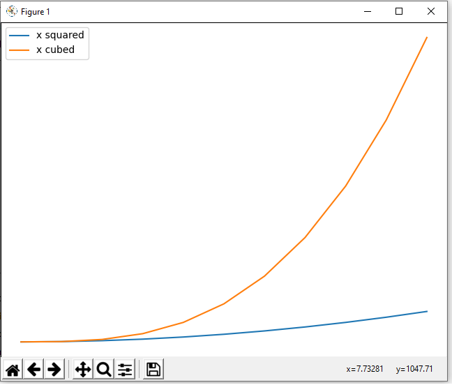
So now you see a figure object with a legend on it.
See how the legend is put to the left upper corner of the graph figure by default.
Depending on the software you are using will determine where the legend goes, but you can figure the legend to be anywhere on the graph.
To manually position the legend on a figure, you can use the loc attribute and set it equal to a number of different values depending on where the legend to be located on the figure.
If you specify, axes.legend(loc=0), this will set the legend to the 'best' location that matplotlib finds fit.
Below is a table of values of where the legend will be located if you specify loc is equal to the respective value.
| Location String | Location Code |
| best | 0 |
| upper right | 1 |
| upper left | 2 |
| lower left | 3 |
| lower right | 4 |
| right | 5 |
| center left | 6 |
| center right | 7 |
| lower center | 8 |
| upper center | 9 |
| center | 10 |
So you can choose loc to be equal to any integer value on the right to set it to any location.
If none of these locations work, you can specify a tuple consisting of the x and y coordinates where you want the legend to be located. So, for example, you can use the line, axes.legend=(loc=(0.1,0.2))
This specifies that the legend should be located 10% from the left and 20% from the bottom.
And this is how to add a legend to a graph figure
in matplotlib with Python.
Related Resources
How to Randomly Select From or Shuffle a List in Python