
How to Add Markers to a Graph Plot in Matplotlib with Python

In this article, we show how to add markers to a graph plot in matplotlib with Python. We also show how to customize these markers to change the inside of the markers to any color, change the size of the markers, change the color of the edge of the marker, and change the size edge of the markers.
So markers are useful when your plot has just a few plot points and you want to mark them off.
Markers can be created with a 'o', 'x', or '+'.
We also show how to do several customizations, including increasing or decreasing the size of the markers, changing the inside color of the markers, changing the edge color of the markers, and changing the size of the edge of the markers.
In the following code below, we show how to add markers to a graph plot, as
well as do several customizations, which will be explained in depth below.
So the first thing we have to do is import matplotlib. We do this with the line, import matplotlib.pyplot as plt
We then create a variable fig, and set it equal to, plt.figure()
This creates a figure object, which of course is initially empty, because we haven't populated it with anything. We then add axes to this figure. We then have our x coordinates that range from 0 to 10.
We then plot the square of the x coordinates.
It is with the plot() function that we add markers to the graph. We do this with the marker attribute. In this case, we set the marker equal to 'o', which gives a 'o' at each x-y coordinate plot.
Lastly, we show the figure with the show() function.
This works if you're using a python IDE other than jupyter notebooks. If you are using jupyter notebooks, then you would not use, plt.show(). Instead you would specify in the code right after importing matplotlib, %matplotlib inline
This line allows the figure of a graph to be shown with jupyter notebooks.
After running the following code above, we get the
following graph plot with markers
in the image below.
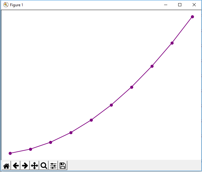
So you can see the markers present in the graph plot.
Now let's go into the many customizations we can do with markers in matplotlib.
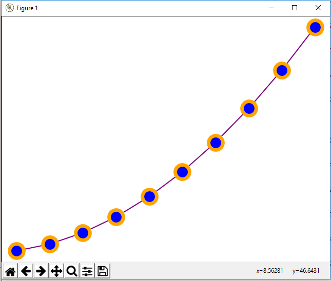
In the following code below, we increase the size of the markers, change
the inside color of the markers to blue, and make the outside edge thicker and the color
brown.
So let's go over the code now.
Inside of the plot() function is where we do all marker customization.
So the marker we use is still 'o'
We set the marker size to 20, making it much bigger than the default value. The marker size is set by the attribute, markersize.
We then change the inside of the makrker with the attribute, markerfacecolor. We set this to blue in this case. You can see that the inside of the marker is blue.
We then set the marker edge width with the attribute, markeredgewidth. We set this equal to 5.
We then set the marker edge color with the attribute, markeredgecolor. We set the color equal to brown.
After all of this code, we get the following graph plot with customized
markers shown below.
And this is how to add markers to a graph in matplotlib with Python.
Related Resources
How to Randomly Select From or Shuffle a List in Python