
How to Add X and Y Labels to a Graph in Matplotlib with Python

In this article, we show how to add X and Y labels to a graph in matplotlib with Python.
So with matplotlib, the heart of it is to create a figure.
On this figure, you can populate it with all different types of data, including axes, a graph plot, a geometric shape, etc.
Most of the time, you will create axes so that you can add numerical values to the X and Y coordinates.
So matplotlib has a built-in set_xlabel() function and a set_ylabel() function which will enable us to add x and y labels to the graph axes.
This is shown in the following code below.
So the first thing we have to do is import matplotlib. We do this with the line, import matplotlib.pyplot as plt
We then create a variable fig, and set it equal to, plt.figure()
This creates a figure object, which of course is initially empty, because we haven't populated it with anything.
So we have a figure object stored in the variable, fig, that is empty.
We then add axes to this figure using the add_axes() function.
This add_axes() function takes in a list of values. The values from the left to right are the left, bottom, width, and height.
They are numbers that vary from 0 to 1 and represent the percentage of the blank figure that you want to go and take.
So for this figure in our code, we have the line, axes= fig.add_axes([0.1,0.1,0.8,0.8])
This adds axes to the figure.
Next, we add an x label for the horizontal axis and we add a y label for the vertical axis.
We add an x label for the horizontal axis with the set_xlabel() function. We set the x label to "Time" in the code.
We add a y label for the vertical axis with the set_ylabel() function. We set the y label to "Time Squared" in the code.
To show this graph, we use the line, fig.show()
This works if you're using a python IDE other than jupyter notebooks. If you are using jupyter notebooks, then you would not use, plt.show(). Instead you would specify in the code right after importing matplotlib, %matplotlib inline
This line allows the figure of a graph to be shown with jupyter notebooks.
After running the following code above, we get the following grap shown
in the image below.
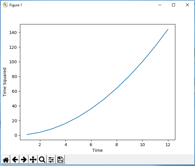
So now you see a graph with x and y labels for the x and y axis.
And this is how to add x and y labels to a graph in matplotlib with Python.
Related Resources
How to Randomly Select From or Shuffle a List in Python