
How to Create a Bar Plot in Matplotlib with Python

In this article, we show how to create a bar plot in matplotlib with Python.
So there are several different types of charts or graphs you can make in matplotlib, including line plots, bar graphs, pie charts, scatter plots, etc.
A bar plot (or bar graph) is very common in many different types of data representations and it's something that most people can easily interpret and understand.
Being that it's so commonplace in data representation and analysis, it's great to know how to create bar plots in Python with matplotlib.
And we do this using the bar() function in matplotlib.
First, we create a figure. And then we call the bar() function on this figure to create a bar graph on this figure.
In the following code below, we create a bar plot in matplotlib.
So the first thing we have to do is import matplotlib. We do this with the line, import matplotlib.pyplot as plt
We then create a variable fig, and set it equal to, plt.figure()
This creates a figure object, which of course is initially empty, because we haven't populated it with anything.
So we have a figure object stored in the variable, fig, that is empty.
We then have our data.
We create a variable x which is set equal to, [1,2,3]
This means that the x values are 1, 2, and 3.
We then create a variable y which is set equal to, [20,40,60]
This means that for of the x points, the corresponding y values are 20, 40 and 60.
We then plot the bar graph using the statement, plt.bar(x,y)
We then set the title of the bar graph to, Bar Graph 1 of Customer Data
We then set the x label to 'Amount of People'
We then set the y label to 'Money Spent'
Lastly, we show the plotted bar graph using the statement, plt.show()
Once we run this code, we get the following bar plot shown below.
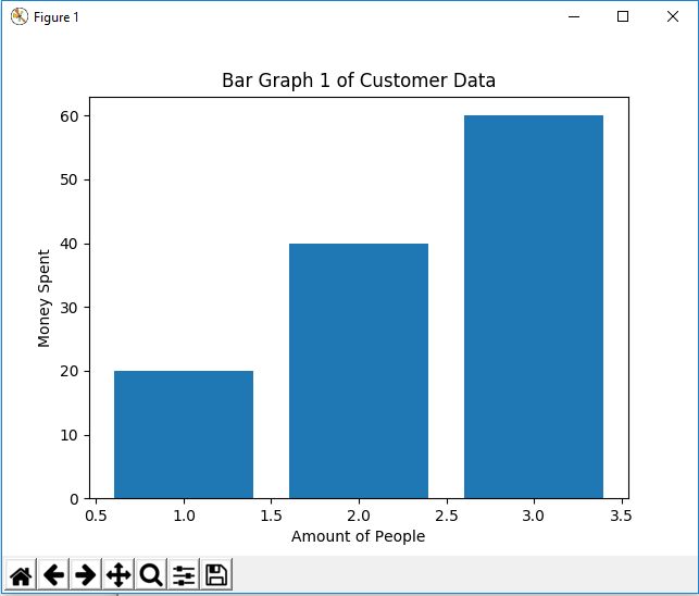
So you can see a pretty nice bar chart above.
One more thing to add is that you don't have to plot all the data sets within one x variable or one y variable.
You can plot multiple bar data within the same figure so that you can differentiate the bar data with a legend.
In the following code below, we plot 2 different sets of data for bar plots and then create a legend based off of this data.
So now we have 2 different plots.
The first plot is a plot of x and y
The second plot is a plot of x2 and y
For each of these plots, we add in a label so that the legend can be labeled.
We then have, plt.legend(), so that we can add a legend to the figure.
After we run this code, we get the following output shown below.

So now you see that we've created a bar plot with a legend in matplotlib with Python.
So this is basically how you can create a bar plot in matplotlib with Python.
Related Resources
How to Randomly Select From or Shuffle a List in Python