
How to Create a Bar Plot in Seaborn with Python

In this article, we show how to create a bar plot in seaborn with Python.
A bar plot is a graph plot in which there are bars in the graph. Each bar represents some type of categorical information.
As an example in the code below, we create a bar plot of the day of the week and the total bill for the day.
A bar graph is a common way to represent data in a graphical way, because it allows for easy visualization of data in a way people are familiar with seeing the data.
We can creat a bar plot in seaborn using the barplot() function.
Within this barplot() function, we specify the data for the x-axis, the data for the y-axis, and the data set that you are referencing.
By default, the barplot() function plots the average for the category in mention.
So, for example, as we are going to create a bar plot that plots the total_bill that occurs for separate days of the week, the value is given as the average total_bill per day of the week.
By default, the results are the average.
We see this below in the bar plot below.
In the following code, we create a bar plot that plots the day of the week as the x-axis and the total_bill as the y-axis.
By convention, we import seaborn as sns.
In order to see the graph within the editor, we put in the statement, %matplotlib inline
You put this statement in if you are using an editor such as jupyter notebooks so that you can see the graph output in the editor.
Seaborn already has built-in data sets.
One data set that can be used is tips.
We import this dataset with the line, tips=sns.load_dataset('tips')
We then output the contents of tips using tips.head() You can see that the columns are total_bill, tip, sex, smoker, day, time, and size.
We then create a bar plot with the day column as the x data and the total_bill as the y data. The data set is the tips data set.
This plots out the following bar plot shown below.
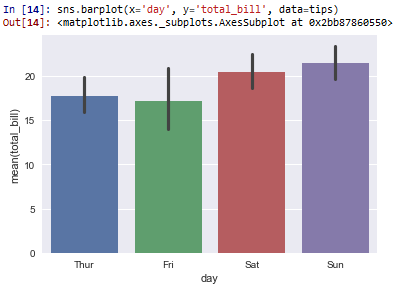
So based on this plot, you can see that that the day of the week, on average, where the total_bill is the highest is on Sundays. The total_bill on Sundays is about $22 or so.
On Saturdays, the total_bill is the second highest, where it's just over $20.
I guess it's more expensive to eat out on the weekends.
The third highest is on Thursdays and the cheapest is on Fridays.
Again, the bar plot, by default, plots the average. So it calculates all the data for each Sunday, Saturday, Friday, and Thursday and computes the average from the data set. And this is the average that you see above in the plot.
Bar plots are a great way to visually represent data and it's very familiar
to most people.
And this is how to create a bar plot in seaborn with Python.
Related Resources
How to Randomly Select From or Shuffle a List in Python