
How to Create a Countplot in Seaborn with Python

In this article, we show how to create a countplot in seaborn with Python.
Seaborn is a module in Python that is built on top of matplotlib that is designed for statistical plotting.
Seaborn can create all types of statistical plotting graphs.
One of the plots that seaborn can create is a countplot.
A countplot is kind of likea histogram or a bar graph for some categorical area. It simply shows the number of occurrences of an item based on a certain type of category.
So in the following code below, we show how to create
a countplot based on a
category.
By convention, we import seaborn as sns.
In order to see the graph of code within the editor, we put in the statement, %matplotlib inline
You put this statement in if you are using an editor such as jupyter notebooks so that you can see the graph output in the editor.
Seaborn already has built-in data sets.
One data set that can be used is tips.
We import this dataset with the line, tips=sns.load_dataset('tips')
We then output the contents of tips, and you can see that it is a data set composed of columns.
The columns are total_bill, tip, sex, smoker, day, time, and size.
There are 244 rows of data we are plotting off of.
Countplots are plots that graph a certain column to show the number of times an item occurs in a data set. And the column represents a certain category.
In our example, we plot a countplot of the occurrences of days that appears in the tips data set.
Remember that there are 244 items of data from the tips data set.
The countplot shows the occurrences of the days of the week that are represented in the days column of the tips data set.
The countplot is shown below.
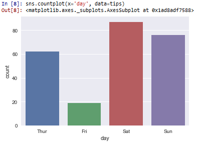
Thus, we can see the occurrences of the days.
Friday occurred with the greatest frequency, just about 90 times.
Saturday had the next greatest frequency of occurrences at just about 75.
Thursday then occurs the most at about 62.
Then Friday at about 18.
This is the use of a countplot in seaborn.
It's very much like a histogram or a bar graph, plotting the number of occurrences of an item in a data set.
And this is how to create a countplot in seaborn with Python.
Related Resources
How to Randomly Select From or Shuffle a List in Python