
How to Create a Histogram in Matplotlib with Python

In this article, we show how to create a histogram in matplotlib with Python.
So there are several different types of charts or graphs you can make in matplotlib, including line plots, bar graphs, histograms, pie charts, scatter plots, etc.
A histogram is very much like a bar plot in appearance (visually); however, it's very different in the way that is is structured.
Let's say that we have a number of test scores.
A bar plot will plot each individual test score.
A histogram will aggregate scores in a certain range.
With a histogram, you create something called bins. Let's say we have test scores that are graded on a scale of 0 to 100. We can creates bin of 10. The histogram will then plot out how many scores there are from 0-10, 10-20, 20-30,30-40,40-50, 60-70, 70-80,80-90,90-100.
This makes histograms visually easier when seeing overall students did on an exam.
Bar plots, again, just plot out the individual test scores.
In the following code below, we have a number of test scores.
We creates bins from 30 to 100 in intervals of 10 in order to aggregate scores
from 30-100 in intervals of 10.
So the first thing we have to do is import matplotlib. We do this with the line, import matplotlib.pyplot as plt
We then create a variable, testscores.
This variable, testscores, contains a list of the grades of tests. This is how various students did on an exam.
We then have a variable called bins.
This variable, bins, contains a list of numbers from 30 to 100 in intervals of 10.
The variable, bins, is how we want to aggregate x values, how we want to clump them together.
We do it in groups of 10, so we are able to see in this plot how many students scored between 30-40, how many scored between 40-50, 50-60, 60-70,70-80,80-90, and 90-100.
This is again because the bins are in intervals of 10.
If you wanted to show bins in intervals of 20, then you could have the following, bins=[20,40,60,80,100]
Then you could see how many students scored between 20-40, 40-60,60-80, and 80-100.
We then plot the histogram using the plt.hist() function.
Inside of this plt.hist() function, we specify testscores, bins, histtype='bar', and rwidth=0.8.
We must specify an rwidth, or else the different plots for the histogram will be connected together. We want the bar plots separated, so we specify a value, 0.8.
Once we run the following code above, we get the following output shown below.
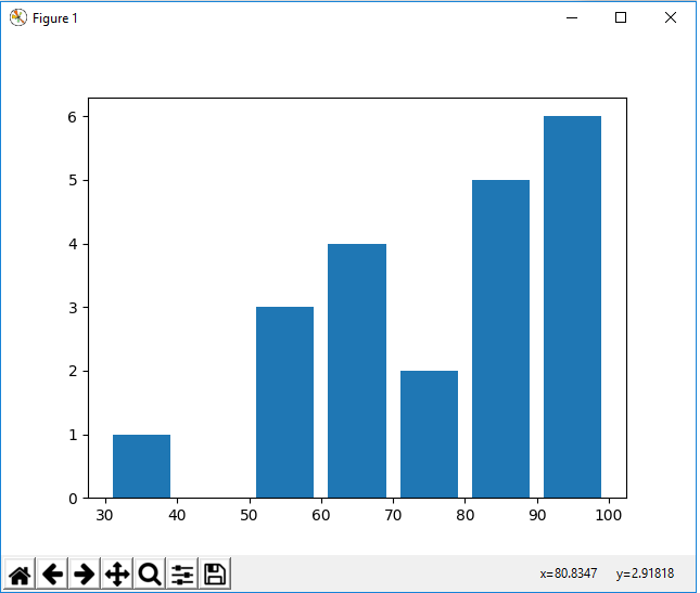
Looking at the histogram, you see that 1 student scored between 30 and 40. 3 students scored between 50 and 60. 4 students scored between 60 and 70. 2 students scored between 70 and 80. 5 students scored between 80 and 90. 6 students scored between 90 and 100.
So this is very different than a bar plot, because a bar plot just plots the individual scores instead of the scores within a certain interval, or bin.
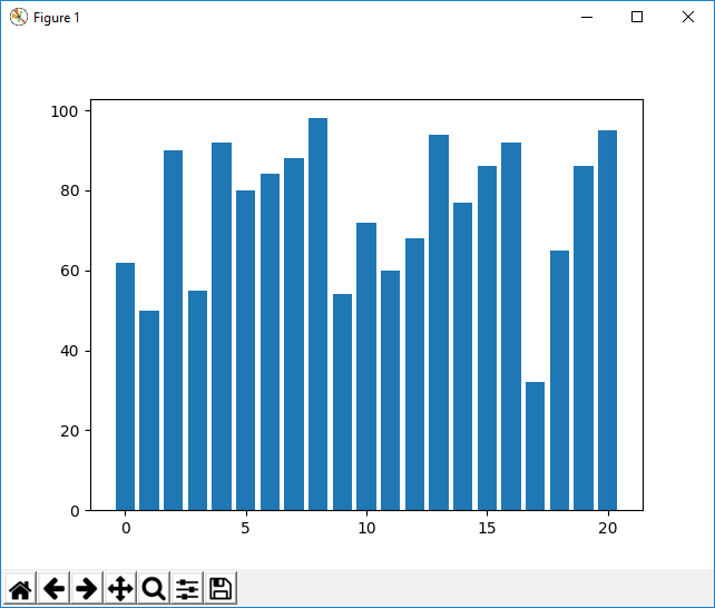
Below we show the code for a bar plot of the same test scores.
Again, this is the same data as the histogram.
The only difference is we do a bar plot. Instead of with bins, we just have a sequential x counter from 1 to the length of the test scores.
This bar plot is shown at the following link: Bar Plot of Test Scores.
You can see that a bar plot for this data is much harder to visualize than a histogram to see how students performed.
One last thing to note when using histograms is that there is an attribute called cumulative. By default, cumulative is set equal to False. But if you set it equal to True, then each surpassing bin is cumulative compared to the previous unlike the whole data set is accounted for.
Below we have our code for a histogram in which
cumulative is set equal to True.
So the only thing we've changed now is that we set the cumulative attribute to True.
This histogram, where cumulative=True, is shown below.
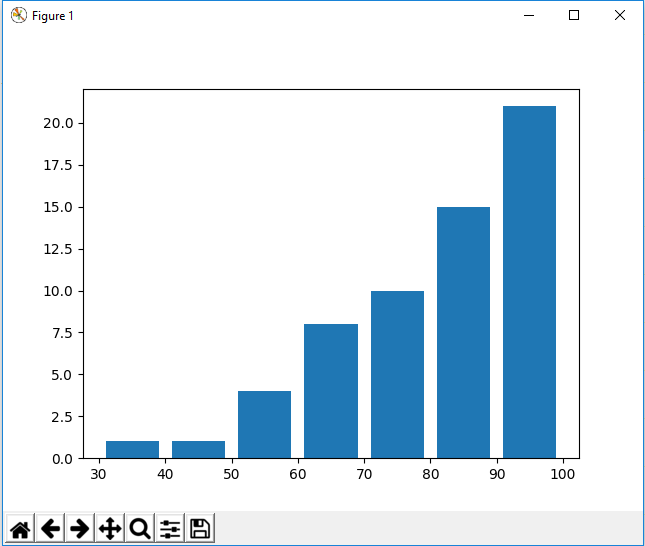
So the only difference is now that it's a cumulative histogram. 1 person scored between 30 and 40. No person scored between 40 and 50, so the amount remains 1 (since 1+0=1). 3 people scored in between 50 and 60, so we have a y-axis of 4 for 50-60 (3+1=4). And then it goes on cumulating until all grades are accounted for at the highest bin, which is 100.
For something like test scores, a histogram like this wouldn't make
the most sense, but it is good to know about this cumulative attribute.
And this is how to create a histogram in matplotlib with Python.
Related Resources
How to Randomly Select From or Shuffle a List in Python