
How to Create a Kernel Density Estimation (KDE) Plot in Seaborn with Python

In this article, we show how to create a kernel density estimation (KDE) plot in seaborn with Python.
Kernel density estimation is a way of smoothing out plotting points in a graph in order to get an estimation of the plotting points.
Kernel density estimation is calculated by averaging out the points for all given areas on a plot so that instead of having individual plot points, we have a smooth curve.
So in Python, with seaborn, we can create a kde plot with the kdeplot() function.
Within this kdeplot() function, we specify the column that we would like to plot.
In the following code below, we plot the 'total_bill' column of the
built-in tips data set from seaborn.
By convention, we import seaborn as sns.
In order to see the graph within the editor, we put in the statement, %matplotlib inline
You put this statement in if you are using an editor such as jupyter notebooks so that you can see the graph output in the editor.
Seaborn already has built-in data sets.
One data set that can be used is tips.
We import this dataset with the line, tips=sns.load_dataset('tips')
We then output the contents of tips using tips.head() You can see that the columns are total_bill, tip, sex, smoker, day, time, and size.
We then create a kernel density estimation plot of the total_bill column using kdeplot() function in seaborn.
This plots out the total_bill column, which is shown below.
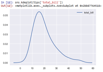
So based on this plot, you can see that the majority of the total bills are roughly between 10 and 20.
Again with kernel density plots, you don't see individual plot points. Instead, you see a smooth curve representing the average for a given area.
And this is how to create a kernel density estimation (kde)
plot in seaborn with Python.
Related Resources
How to Randomly Select From or Shuffle a List in Python