
How to Create a Matrix Plot in Seaborn with Python

In this article, we show how to create a matrix plot in seaborn with Python.
A matrix plot is a plot of matrix data.
A matrix plot is a color-coded diagram that has rows data, columns data, and values.
We can create a matrix plot in seaborn using the heatmap() function in seaborn.
With the heatmap() function, we specify the matrix data that we want to plot.
Inside of this heatmap() function, we also specify optional parameters, such as to place the value of the data inside of each of the data points and to create a different color pattern for the matrix plot.
In the following code below, we create a matrix plot
based off of the built-in flights data set in seaborn.
By convention, we import seaborn as sns.
In order to see the graph within the editor, we put in the statement, %matplotlib inline
You put this statement in if you are using an editor such as jupyter notebooks so that you can see the graph output in the editor.
Seaborn already has built-in data sets.
One data set that can be used is tips.
We import this dataset with the line, flights=sns.load_dataset('flights')
We then output the contents of tips using flights.head() You can see that the columns are year, month, and passenger.
We then convert this data set into a matrix using the line, fp= flights.pivot_table(index='month', columns='year',values='passengers')
So now fp holds the matrix data for the flights data set.
We then call the heatmap() function on this fp matrix data.
This plots the following matrix plot shown below.
After this function, you can now see this arrangement.
Again, this is an import conversion, because in order to plot matrix plots, the data needs to be in matrix format first.
And this is how to create a matrix from a data set in seaborn with Python.
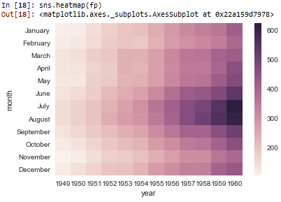
You can see the color-coded data on this matrix plot.
The graph all the way to the left is very light in color, which shows that there are very few flights. As we go to the right of the matrix plot, it gets darker in color. You can see that the graph is the darkest around August and July of 1960. This shows a big increase in the flights.
If we then run the following code, putting, cmap='lukewarm'
in the heatmap() function, we get the following plot shown below.
So now all the code is the same except we added the statement, cmap='lukewarm' to the heatmap() function.
This creates the color matrix plot seen below.
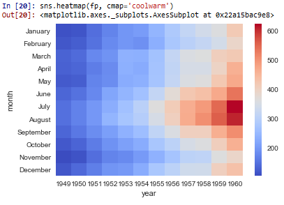
Now it's probably a little easier to visually see the matrix plot with this color pattern.
With a matrix plot, the data is easy to visualize.
And this how to create a matrix plot in seaborn with Python.
Related Resources
How to Randomly Select From or Shuffle a List in Python