
How to Create a Normal Distribution Plot in Python with the Numpy and Matplotlib Modules

In this article, we show how to create a normal distribution plot in Python with the numpy and matplotlib modules.
A normal distribution in statistics is distribution that is shaped like a bell curve.
With a normal distribution plot, the plot will be centered on the mean value.
In a normal distribution, 68% of the data set will lie within ±1 standard deviation of the mean. 95% of the data set will lie within ±2 standard deviations of the mean. And 99.7% of the data set will lie within ±3 standard deviations of the mean.
Data that is normal follows this pattern.
So with the numpy module in Python, we can create a normal distribution plot.
We will do this creating random data points in the numpy module.
We do this with the np.random.normal() function.
Inside of this function, we specify the mean, standard deviation value, and the total number of random values we want created.
Once we have this, our normal distribution plot is created.
So in the following code below, we create a normal distribution with a mean centered at 90, with a standard deviation of 2, and 10000 (ten thousand)
random data points created.
So let's break down this code.
We first import the numpy module as np. This means that we reference the numpy module with the keyword, np.
We then import the matplotlib module plotting function because we are going to plot the data.
So we use the numpy module to create the data and then we use the matplotlib module to plot the data.
We create a variable, values, and assign it to, np.random.normal(90,2,10000)
What this line does is it creates the data for a normal distribution plot centered around a mean of 90, showing 2 standard deviations of the data, and creates 10,000 random data points that are of normal distribution. Remember this is the normal() function, which means that the data will be normalized. 68% of the data values will generated will be (or very close to) ±1 standard deviations of the mean. 95% of the data values generated will be within ±2 standard deviations of the mean. 99.7% of the data values generated will be within ±3 standard deviations of the mean.
We then plot a histogram with 50 bins with the line, plt.hist(values,50)
We then show this graph plot with the line, plt.show()
After running this code, we get the following output shown below.
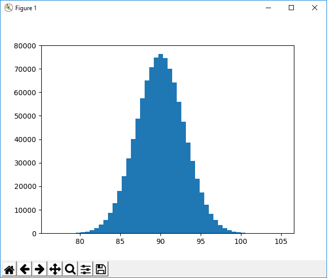
So you see that this plot has a mean centered around 90 and shows the data out to and 3 standard deviations.
There are 10,000 random data points generated.
And this is how to create a normal distribution plot in Python
with numpy and matplotlib.
Related Resources
How to Randomly Select From or Shuffle a List in Python