
How to Create a Pairplot Graph in Python using the Seaborn Module

In this article, we show how to create a pairplot graph in Python using the seaborn module.
A pairplot graph is a graph that plot that plots pairwise relationships in a dataset. For example, in a dataset that compares the test scores of men and women, it would plot the data of men in green and the the data of women in red beside each other so that the two can be compared. In a dataset comparing cats with dogs, it would plot the data of cats in blue and dogs in red. This is so that you can easily see the relationship between cats and dogs highlighted well. If you are comparing treated wood vs untreated wood, it would plot each in separate colors on a graph, which creates a good tool for visualizing data.
Seaborn has a pairplot() function, which plots the pairwise data. Because dataset can have many facets, you specify what variable you want to compare pairwise.
In our example code below, we will use the iris dataset from the seaborn module. There is a attribute, hue, where you specify what you want to compare pairwise. In our example, we do a pairwise graph based on the species of the flowers in the dataset.
Below is the Python code that uses creates a pairplot graph using the seaborn module.
The first thing we have to do is import our modules, including seaborn and matplotlib. Matplotlib is used to display the graph.
We create a variable, iris, which we set equal to the imported iris dataset from seaborn.
We then create a pairplot graph of the iris dataset, with species being the variable to map into differentiating colors.
The graph that the above code produces is shown below.
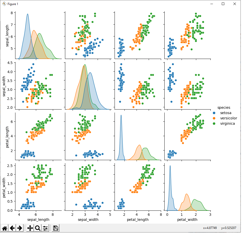
There are 3 species in the iris dataset: setosa, versicolor, and virginica.
Thus, there are 3 distinct colors in each of the graphs. The setosa species is in blue. The versicolor species is in orange. And the virignica species is in green.
Each of these species is compared with each of the other variables in the dataset. For the iris dataset, this includes the sepal length (of each species), the sepal width, the petal length, and the petal width.
Thus, you can see how each species compares with other species according to all the other quantified data in the dataset.
So using a pairplot graph is an excellent tool to visualize pairwise data to visually
see how they match up together.
And this is how to create a pairplot graph in Python using the seaborn module.
Related Resources
How to Randomly Select From or Shuffle a List in Python