
How to Create a Regression Plot in Seaborn with Python

In this article, we show how to create a regression plot in seaborn with Python.
A regression plot is a linear plot created that does its best to enable the data to be represented as well as possible by a straight line.
A regression plot creates a straight line that tries to match as close as possible the points in a given data set. It's best approximation, represented by a straight line, for all of the various data points for a data set.
Regression plots are used a lot in machine learning.
We can make regression plots in seaborn with the lmplot() function.
With the lmplot() function, all we have to do is specify the x data, the y data, and the data set.
In the following code shown below, we plot a regression plot of the total_bill as the x axis and the tip as the y axis.
By convention, we import seaborn as sns.
In order to see the graph within the editor, we put in the statement, %matplotlib inline
You put this statement in if you are using an editor such as jupyter notebooks so that you can see the graph output in the editor.
Seaborn already has built-in data sets.
One data set that can be used is tips.
We import this dataset with the line, tips=sns.load_dataset('tips')
We then output the contents of tips using tips.head() You can see that the columns are total_bill, tip, sex, smoker, day, time, and size.
We then plot the regression plot of the x-axis being the total_bill and the y-axis being the tip and the data being tips. We do this with the line, sns.lmplot(x='total_bill', y='tip', data=tips)
By having this line, we get the following regression plot shown below.
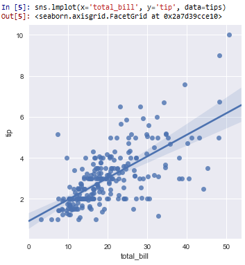
So you can see all the data points of how much each tip is for a given total bill.
You can see the regression plot for all the data points, represented by a straight line that gives the best average for the all the data points.
In the following code below, we add a hue='sex' statement, in order to get separation of the tip per total_bill for each gender (male and female)>
This is shown in the following code below.
So now with the statement, hue='sex' added to the lmplot() function, we get a regression plot of the tip per total_bill given by each gender.
This is shown in the following diagram below.
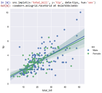
And now you see the tip per total_bill given by each gender.
You can see that for males and females, it is pretty much the same.
And this how to create a regression plot in seaborn with Python.
Related Resources
How to Randomly Select From or Shuffle a List in Python