
How to Create a Scatter Plot in Matplotlib with Python

In this article, we show how to create a scatter plot in matplotlib with Python.
So there are several different types of charts or graphs you can make in matplotlib, including line plots, bar graphs, histograms, pie charts, scatter plots, etc.
A scatter plot is a plot in which there are just individual points on a a graph.
There are no connected lines, bars, etc. There are just floating points.
In the following code below, we create a scatter plot.
So the first thing we have to do is import matplotlib. We do this with the line, import matplotlib.pyplot as plt
We then create a variable, testscores.
This variable, testscores, contains a list of the grades of tests. This is how various students did on an exam.
We then have a variable called timestudying. This represents the time that a student spends studying.
We then plot the scatter plot using the statement, plt.scatter(timestudying, testscores)
The first parameter, timestudying, is the x-axis data.
The second parameter, testscores, is the y-axis data.
We then add a title, along with x and y labels.
We then have plt.show() in order to show the graph.
Once we run the following code above, we
get the following output shown below.
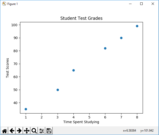
You can see that the points are just plotted and aren't connected. This is why they are called scatter plots.
Now we can make 2 different sets of data. We can color code these data points and add markers to them.
This is shown in the following code below.
So now we have 2 different sets of y data.
We have test scores from class 1 in the variable, testscores_class1=[35, 50, 65, 82, 90, 99]
We have test scores from class 2 in the variable, testscores_class2=[85, 90, 92, 95, 97, 100]
We have the same x-data (time spent studying for the exam).
It's just that class 2 studies so much more effectively than class 1 and were able to get better grades.
We plot both scatter plots on the same figure.
We add in the title, x label, and y label, labels, and a legend.
We then show the plot using the statement, plt.show()
This is shown in the following output below.

So now you see a scatter plot with different markers and colors, along with a legend that labels the data.
So now you have an idea of how scatter plots work in matplotlib and how they can be used to represent various sets of data.
And this is how to create a scatter plot in matplotlib with Python.
Related Resources
How to Randomly Select From or Shuffle a List in Python