
How to Create a Stack Plot in Matplotlib with Python

In this article, we show how to create a stack plot in matplotlib with Python.
So there are several different types of charts or graphs you can make in matplotlib, including line plots, bar graphs, histograms, pie charts, scatter plots, stack plots, etc.
A stack plot is a plot that shows the whole data set with easy visualization of how each part makes up the whole.
Each constituent of the stack plot is stacked on top of each other.
It shows the part makeup of the unit, as well as the whole unit.
It's kind of like a pie chart in that it shows all the various constituents of a data set. However, it is still different, because stack plots have axes, unlike pie charts which don't. Pie charts have basically one numerical data set with labels.
So in the following code below, we're going to create a stack plot
in which we plot the mortgage, utilies, food costs, and repairs costs for a household
for each month of the year.
So the first thing we have to do is import matplotlib. We do this with the line, import matplotlib.pyplot as plt
We then create a variable, months, which will represent our x-axis data.
Since there are 12 months in a year, we create a list comprehension that sets x equal to 1 to 13.
We then create another variable, mortgage, and set it equal to a list of 12 mortgage values that were paid for the year. Each value corresponds to each month on the year in the month order (January, February, March ...)
We then create another variable, utilities, and set it equal to a list of 12 utility values that were paid for the year. Like the mortgage, each value corresponds to each month of the year in order.
We then create another variable, repairs, and set it equal to a list of 12 repair values that were paid for each month of the year.
Next what we have to do is specify plt.plt() values for each of the constituents of the stack plot. The reason we do this is because there is no way of adding legend data to the individual mortage, utilities, and repairs variables. So we add this information with the plt.plot() function. In these, we specify the color and the label for each constituent. We make the mortagage a blue color and the label, 'mortgage'. We make the utilities an orange color and the label, 'utilities'. We make the repairs a brown color and the label, 'repairs'.
We then have the line, plt.stackplot(months, mortgage, utilities, repairs, colors=['blue', 'orange', 'brown'])
This creates a stack plot, with the months variable being the x-axis. And the mortgage, utilities, and repairs being the y-data plotted on the stack in the order specified. This means that the 1 to 12 makes up the x-axis. And the mortgage is plotted at the bottom, with the utilities in the middle, and the repairs on top.
We specify the colors attribute, so that the colors we created in the plt.plot() functions to make the legend matches the colors in the stackplot.
We then add the legend, title, x-label, and y-label.
We then show the plot.
When we run this code, we get the following output shown below.
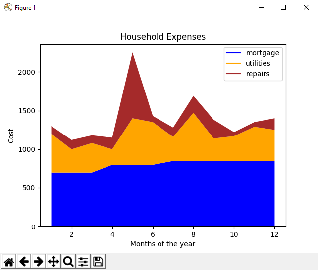
So we can see the mortgage is pretty much stable, with a slight increase throughout the year. The utilities are the highest in the summer months. And the repairs were the highest in May.
And this is how a stack plot can be used to show various types of data.
And this is how to create a stack plot in matplotlib with Python.
Related Resources
How to Randomly Select From or Shuffle a List in Python