
How to Create Grids in Rows and Columns in Seaborn with Python

In this article, we show how to create grids in rows and columns in seaborn with Python.
So we can separate different graph plots in seaborn into various rows and columns, as we would want.
We can do this with the col and row attribute.
With the col attribute, we can separate different graph plots into columns.
With the row attribute, we can separate different graph plots onto new rows.
So let's see how this works below.
So if you know the hue attribute in seaborn, it splits data based on the categories. For example, if we specify, hue='sex', it will show the data points of sex for males and females on the same graph plot.
However, you don't have to show different data points on the same graph (or grid) if you don't want. You can show the male data on one graph and the female data on another graph.
In the following code below, we use the col attribute to
separate male and female data points for the total_bill vs the tip.
By convention, we import seaborn as sns.
In order to see the graph within the editor, we put in the statement, %matplotlib inline
You put this statement in if you are using an editor such as jupyter notebooks so that you can see the graph output in the editor.
Seaborn already has built-in data sets.
One data set that can be used is tips.
We import this dataset with the line, tips=sns.load_dataset('tips')
We then output the contents of tips using tips.head() You can see that the columns are total_bill, tip, sex, smoker, day, time, and size.
We then plot a graph of the total_bill as the x-axis and the tip as the y-axis.
There are 2 of these graphs produced, placed into separate columns. This is because we specify the col attribute is equal to sex, which means that the different graphs will represent data for the different sexes (male and female).
After we run this, we get the following output shown below.
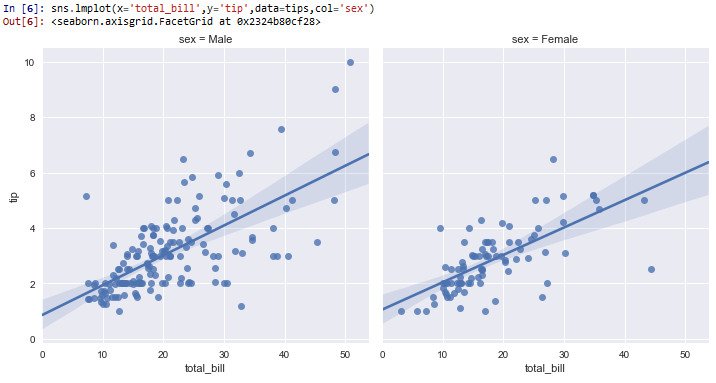
So you see that the grids are separated by sex of the total_bill vs the tip, since we separate it by the col attribute.
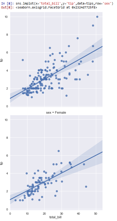
Next, below, we show how to separate data into rows. This is done by the row attribute.
In the following code below, we produce the same graphs as above, but instead of separating the graph plots into columns, we separate them into
rows.
So the only thing that changed is this code is instead of having, col='sex', we now have, row='sex'
This produces the following output shown below.
Next, we will create grids that have both rows and columns.
In the following code below, we plot the total_bill as the x-axis and the tip as the y-axis, with the columns differentiated between the sexes
(males and females). Each row shows a different time of day as it relates to the total_bill and the tip given (one lunch and the other dinner).
So you can see we specify the col equal to sex and the row equal to time.
This produces the following output shown below.
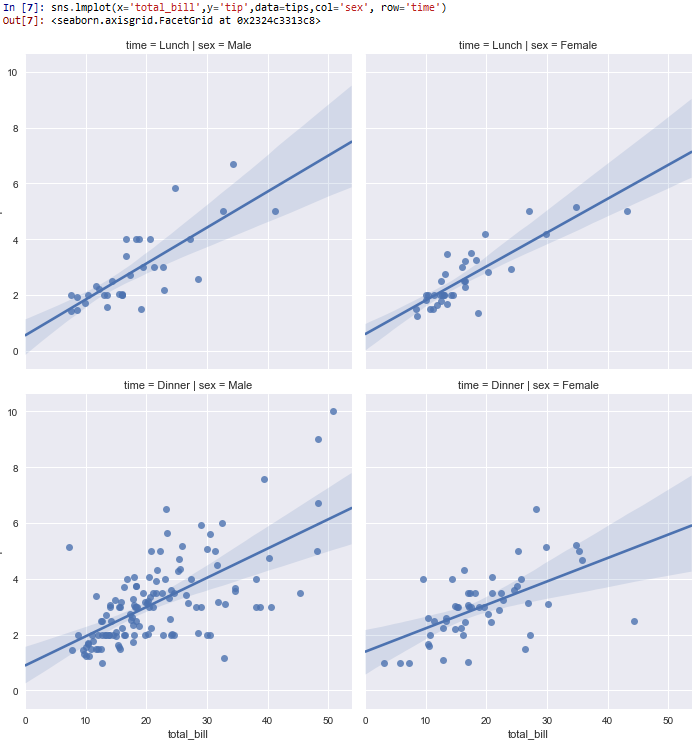
So you can see that the columns are separated according to the sex (male and female).
The rows are separated by the time of day (lunch and dinner).
All plots give the total_bill as the x-axis and the tip as the y-axis.
And this how to create grids in rows and columns in seaborn with Python.
Related Resources
How to Randomly Select From or Shuffle a List in Python